Blog

How To Evaluate Agentic Ai Vendors For Cx
Blog

How to Evaluate Agentic AI Vendors for CX (Beyond the Demo)

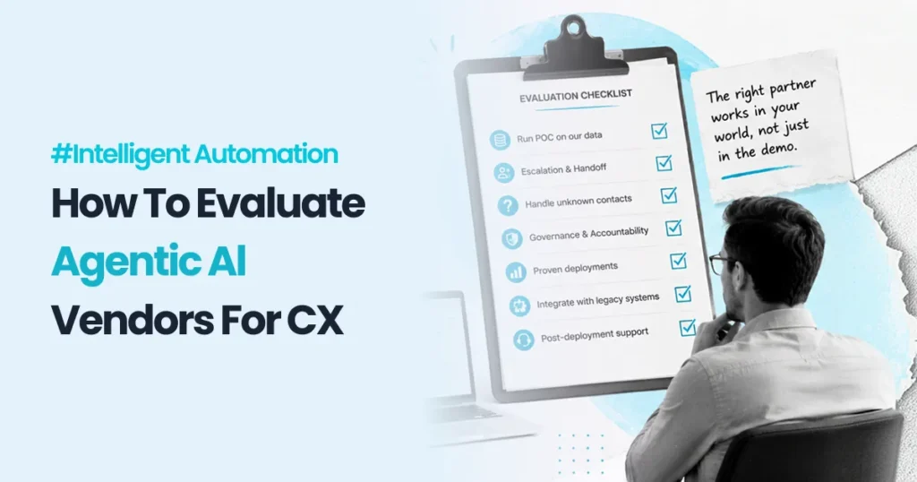
Four vendors on the shortlist. Four demos in eight days. Every one of them impressive, articulate, and apparently capable of resolving a customer inquiry end to end without human involvement. The CIO closes the laptop after the last session and realises they have learned almost nothing that distinguishes one from another. What they actually need to know is which of these four will still be working in March, once it has met the CRM that has been running since 2011 and the ticketing system nobody has fully documented. That gap between the demo and day one is where agentic AI programs are won or lost. Knowing how to evaluate agentic AI vendors for CX is now one of the highest-stakes procurement decisions in the enterprise, and the evaluation criteria most organisations use are borrowed from a software buying process that does not apply. You are not buying a product. You are buying a system that will make autonomous decisions on your behalf, in your environment, against your data. Here is what we actually think, based on delivering agentic AI in production: most agentic AI vendors will show you a demo that works perfectly in a clean environment. The only question that matters is what happens when it meets your actual systems on day one. Everything else in the evaluation is secondary to that. This post gives you the questions that expose the difference. Why every agentic AI demo looks the same, and why that is the problem A demo environment is a controlled environment. The data is clean, the integrations are stubbed or purpose-built, the customer intents are the ones the vendor has already trained against, and the edge cases have been quietly removed from the script. Nothing about that is dishonest. It is simply what a demo is. The problem is that your environment is the opposite of that. Your customer data lives across three systems with inconsistent formatting. Your CRM has custom fields that were added six years ago by someone who has since left. Your contact reasons include a long tail of genuinely unusual requests that do not appear in any vendor’s training set. Your ticketing system has an API with undocumented rate limits. An agentic AI system that performs beautifully in a demo and badly in your environment has not malfunctioned. It has simply encountered the reality it was never tested against. This is why the most valuable thing you can ask a vendor to do during evaluation is not a demo at all. It is a proof of concept against your data, in your environment, with your worst-case contact scenarios included deliberately. Learn how PAteam deploys agentic AI in production environments. The seven questions that separate a real agentic AI partner from a good demo These are the questions that consistently expose capability gaps during evaluation. Ask them in this order. Can you run a proof of concept against our data, in our environment, on a use case we choose? Not a sandbox. Not a curated dataset. If a vendor resists this or wants to select the use case themselves, that resistance is your answer. What happens when the AI agent cannot resolve the contact? Listen specifically for how escalation to a human is designed. The handoff is where customer experience actually breaks. A vendor who has thought hard about escalation has thought hard about production. How does the system handle a contact type it has never seen before? The long tail is where autonomous systems fail most visibly. A vendor who says the model “handles it” has not been in production long enough. What is your governance model, and who is accountable when the agent gets something wrong? This is the question most vendors are least prepared for. There must be a clear framework covering decision logging, human review thresholds, escalation authority, and remediation. If governance is a slide rather than a system, walk carefully. Show me a client deployment you still operate today, with current volume numbers. Launches are easy to point to. Sustained production volume is the actual proof. Ask for the numbers and ask how long the deployment has been running. How do you integrate with legacy systems that have no modern API? Every enterprise has at least one. The answer to this question tells you whether the vendor has done real enterprise work or only greenfield deployments. What does your post-deployment support model look like? Agentic AI systems drift. Customer behaviour changes, products change, policies change. If the vendor’s engagement ends at go-live, you are accepting all of the ongoing accuracy risk yourself. Why agentic AI implementations fail, and it is rarely the model When an agentic AI deployment underperforms, the instinct is to question the model. Wrong provider, wrong architecture, not enough training data. That is almost always the wrong diagnosis. The failures we see in the field cluster around four causes, and none of them are the model itself. Integration debt. The agent cannot reliably read or write to the systems it needs, so it either guesses or escalates everything. Containment rate stays flat and the business case collapses. Unstructured knowledge. The agent is expected to answer from a knowledge base that is out of date, contradictory, or spread across a wiki, a shared drive, and the heads of three senior agents. The agent is only ever as accurate as the knowledge it can reach. No governance framework. Nobody defined the thresholds at which a human must review a decision, nobody is auditing agent outputs, and nobody owns remediation. The first significant error becomes an executive incident rather than a logged exception. Escalation designed as an afterthought. The agent handles the easy eighty percent well and hands off the hard twenty percent badly, so the customers with the most complex problems get the worst experience. Overall CSAT drops even though containment went up. Think of it this way: deploying an agentic AI system without an integration and governance foundation is like hiring an extremely capable new employee,
Legacy Avaya Migration Challenges
Blog

Legacy Avaya Migration Challenges: Deciding How Much of the Estate to Audit

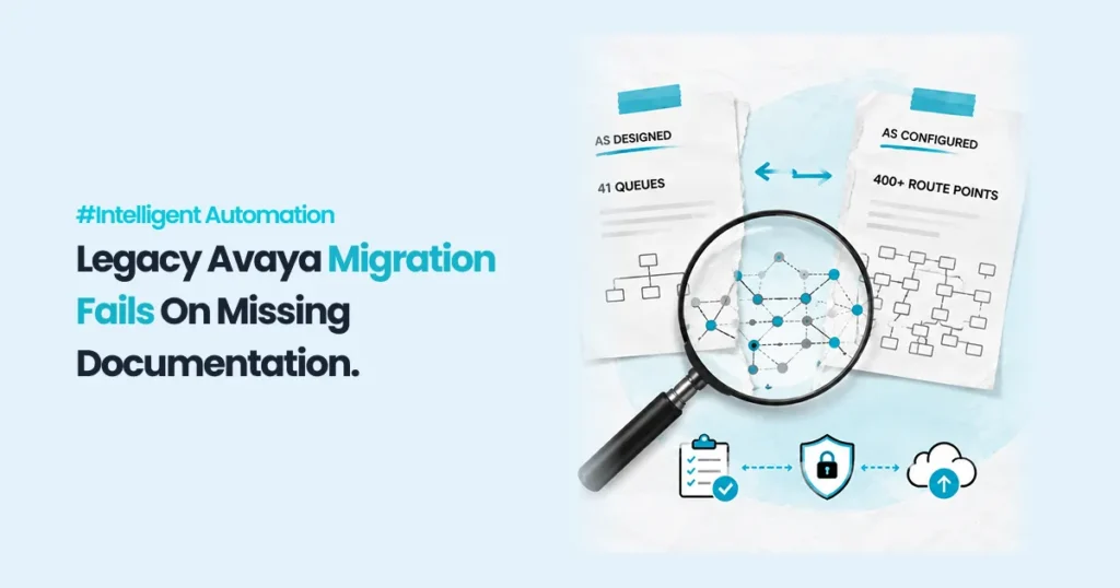
Two documents that disagree The runbook for a legacy contact centre platform said the estate had forty-one queues. The configuration export from the same platform, taken the same week, listed just over four hundred entries carrying routing logic — vector steps, vector directory numbers, hunt groups, announcement branches, holiday tables and the after-hours conditionals nested inside them. Neither document was wrong. The runbook described the estate as designed. The export described the estate as it had been patched, by five different administrators, over roughly a decade of Monday-morning fixes that nobody went back to document. Every serious problem in a legacy migration lives in the gap between those two documents, and the size of that gap is the single number that determines whether the project runs to plan. This is not a lift-and-shift problem or a training problem, though it shows up as both. It is a discovery problem with a price attached, and the price can be calculated before the programme starts. What is actually inside a legacy estate A legacy private branch exchange or on-premise contact centre platform accumulates configuration the way a building accumulates wiring. Some of it carries live traffic today. Some of it was built for a product that was discontinued, a campaign that ended, or an office that closed, and it survives because deleting configuration on a production switch is a risk nobody volunteers for. That distinction is the whole discovery problem, so it needs a definition tight enough to argue with. A live routing behaviour is one that at least one real interaction reached in a defined recent window — ninety days is a reasonable default, and thirteen months if the business has genuine seasonal peaks or statutory-deadline traffic. Everything else is dormant. Dormant configuration still has to be inventoried, because you cannot prove something is dormant without looking at it, but it does not have to be replicated, tested or accepted on the new platform. In the estates we have taken apart, the live share of route points typically lands somewhere between a quarter and a half. Call it a third as a planning assumption and then measure it, because the assumption is doing a lot of work: it sets the size of the target you are aiming at. Two things follow immediately, and both cut against the way migration scopes are usually written. Counting every configuration item is not the goal — replicating every configuration item certainly is not, and a scope that promises functional parity across the whole estate has promised to rebuild the dead parts. But you cannot know which parts are dead without spending money to look, and that spend is not free either. Why the documentation you already have is not the answer The artefact that would resolve this is a current business process narrative — a written description of each contact flow and its handoffs between teams, sitting alongside the diagram. Regulated organisations are expected to maintain exactly that. The FFIEC’s IT Examination Handbook notes that business process diagrams “often depict the handoff between departments that have a role in carrying out different parts of the business activity,” and that narratives “describe the entity’s business processes and related control points, often to support control reporting” (FFIEC IT Examination Handbook, Architecture, Infrastructure, and Operations III.C.3). The expectation is reasonable. What we find on site is that the narrative was accurate on the day it was signed and has not been touched since, while the switch has been edited two hundred times. Documentation ages against a system that does not stop changing, which is why discovery has to sample the live system rather than read the file. What audit coverage costs, and what missing a rule costs Here is the trade, priced. The model below is illustrative, built on planning ranges rather than a single client’s figures, and the point of publishing it is that you can substitute your own four inputs and get a defensible number rather than a vendor’s confidence. The estate has 400 configuration items carrying routing logic. Thirty-five per cent are live, so 140 live routing behaviours exist. Audit coverage, written as c, is the share of configuration items a human actually opens, traces and records. Each item examined costs 1.25 hours at the start, and marginal cost rises as coverage climbs, because the easy items are the ones with obvious names and recent edits — the last ten per cent are the undocumented overflow branches that require call-detail archaeology to interpret. Modelled as a linear rise, the average cost per item at coverage c is 1.25 × (1 + c) hours. Every live routing behaviour costs 2 hours to reproduce and accept on the new platform whether or not the audit found it, because that work is unavoidable. And every live routing behaviour first discovered in production — after cutover, by a customer hitting it — costs an additional 8 hours: triage, a change request, an out-of-hours fix, a regression test, and a conversation with whoever the misroute affected. Blended migration engineering at EUR 82 per hour. Total cost is audit hours, plus production-discovery penalty hours, plus unavoidable build hours. It has a minimum, and the minimum is not at full coverage: Coverage 0%: audit 0 h, production penalty 1,120 h, build 280 h. Total 1,400 h, EUR 114,800. Coverage 30%: audit 195 h, production penalty 784 h, build 280 h. Total 1,259 h, EUR 103,238. Coverage 50%: audit 375 h, production penalty 560 h, build 280 h. Total 1,215 h, EUR 99,630. Coverage 62%: audit 502.2 h, production penalty 425.6 h, build 280 h. Total 1,207.8 h, EUR 99,039.60 — the optimum. Coverage 80%: audit 720 h, production penalty 224 h, build 280 h. Total 1,224 h, EUR 100,368. Coverage 90%: audit 855 h, production penalty 112 h, build 280 h. Total 1,247 h, EUR 102,254. Coverage 100%: audit 1,000 h, production penalty 0 h, build 280 h. Total 1,280 h, EUR 104,960. Read the last three rows before the others.

Why Hire An Rpa Consulting Firm
Blog

Why Hire an RPA Consulting Firm Instead of Building Inhouse

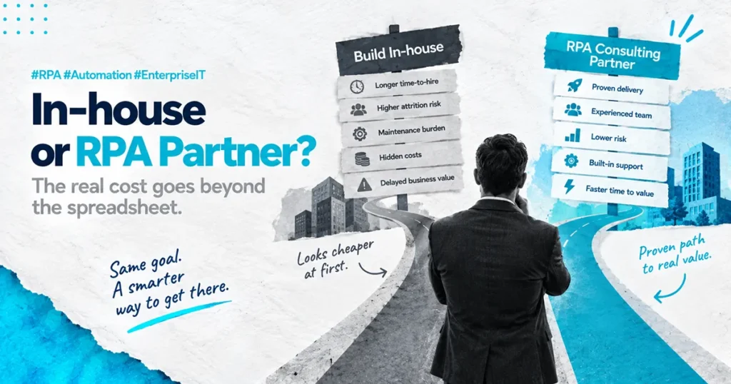
The IT Director has just been handed a budget. Twelve months of headcount, a tooling allocation, and a board-level mandate to “stand up an internal RPA capability.” On paper, this is a win. In practice, sitting at their desk on a Thursday afternoon, they are quietly working out whether they have just inherited a problem that nobody else in the executive team wanted to solve. That feeling is the right instinct. The question of why hire an RPA consulting firm instead of building inhouse is one of the most consequential decisions a COO or CIO will make in the first phase of an automation program. The wrong answer is rarely catastrophic in month three. It is catastrophic in month eighteen, when the bots are unstable, the team is half-staffed, and the ROI case looks nothing like the slide deck that got it approved. Here is what we actually think, based on nearly a decade of enterprise delivery: building RPA inhouse sounds cheaper until you factor in the twelve months it takes to get a developer genuinely productive and the cost of the bots that break in the meantime. The hidden cost of inhouse is not the salary line. It is the time it takes to build the muscle, and what fails while you are building it. This post answers when inhouse makes sense, when it doesn’t, and what good actually looks like. What the inhouse pitch usually leaves out The inhouse business case typically lands on a CFO’s desk looking very clean. Two developers, a process analyst, a part-time architect, an annual RPA license, and a project manager. Total cost on paper looks reasonable, especially compared to a consulting proposal that runs three or four times that number on the surface. The problem is that the inhouse business case is built on the wrong assumption. The assumption is that hiring an RPA developer is the same as hiring any other developer. It is not. A genuinely productive RPA developer is not a person who knows the tool. They are a person who knows the tool, has built bots that survived three system updates, has handled production exceptions at 3am, has worked through a real PDD-to-SDD transition, and has watched at least one of their own automations fail in a way that taught them something. That person does not exist on the open market in most regions. You either hire them from another consulting firm at a significant premium, or you build them, which takes around twelve months from a strong starting point. The inhouse plan rarely accounts for the cost of the bots that get built, deployed, and broken during that twelve-month learning curve. Learn how PAteam manages production RPA at enterprise scale. The real cost of RPA managed services vs in-house team costs Most direct cost comparisons between an internal team and a managed RPA partner come out close. The line-item math looks similar. The gap is in the cost categories that never make it into the spreadsheet. There are five. Recruitment cost and time-to-hire. A senior RPA developer in most enterprise markets takes three to six months to source, interview, offer, and onboard. That is six months of program time burned before any bots are built. Multiply by every role on the plan. Productivity ramp. Even an experienced RPA developer hired into a new business takes three to four months to understand the systems, the data, the processes, and the politics well enough to build production-grade automations. A junior developer takes much longer. Attrition. RPA developers are some of the most heavily recruited technical roles in the enterprise market. The probability that the team you spent twelve months building stays intact for another twelve is low. Every replacement resets the ramp clock. Maintenance debt. Inhouse teams almost always under-resource maintenance. Build is more visible, more rewarding, and easier to plan. Maintenance is invisible until something breaks. By month eighteen, most inhouse teams are spending sixty percent of their capacity maintaining the bots they built in months one to twelve. Opportunity cost. Every month the team is ramping is a month the business is not getting the automation benefit it approved the budget for. That cost rarely appears in the inhouse case but it is real, measurable, and often the largest number of all. A managed RPA partner absorbs all five of these costs into a delivery model that is already built. The bots get built faster, by people who have done it before, with a maintenance model already running. That is the actual comparison, not the salary line. What PAteam does differently with RPA developer training This is where the delivery quality gap actually lives. Most RPA consulting firms train their developers for one to three months before putting them on client work. The math is simple. The faster the developer is billable, the better the firm’s utilization rate. The client wears the cost of that compressed training in the form of bots that break, exception handling that was never thought through, and production issues that surface in month four instead of being designed out in month one. PAteam spends six months training every RPA developer before they touch client production work. Not because we are being generous. Because we have watched, repeatedly, what happens when the training is shorter. The first ninety days cover tooling and certification. The second ninety days cover real failure modes, exception design, the operational realities of a production estate, and how to build automations that survive system updates. The result is that the developer who arrives at your business has already seen what goes wrong. They build with that experience designed in, not bolted on after the first incident. Think of it this way: hiring an undertrained RPA developer is like hiring a pilot whose flight training was rushed. The aircraft will fly in good weather. You will only find out about the gap in their training in the conditions that matter most. What to look for in an RPA implementation

Nice Cxone Certified Implementation Partner Feature Img
Blog

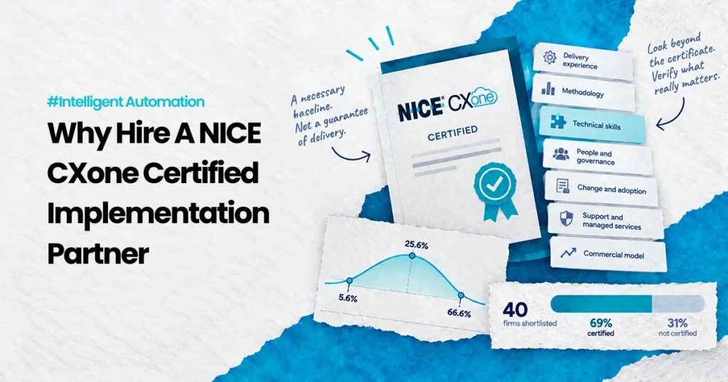
Why Hire a NICE CXone Certified Implementation Partner

Here is a claim about PAteam that is completely true and almost completely useless: our engineers hold NICE CXone certifications. It is true. It is checkable. And on its own it tells you nothing about whether your programme will land, because it is a statement about people passing exams, not about programmes reaching production. Every serious partner you shortlist will make the same claim. If a fact is shared by everyone on your list, it cannot help you choose between them. That is not an argument against certification. It is an argument about what certification is for. A credential is a floor — it removes the firms that cannot clear a minimum. What it does not do is predict outcomes, and the interesting question is what you should verify instead, and what that verification is worth. What a certification formally attests to Take the general case first, because the standards world has already thought about this carefully. ISO publishes a plain-language guide to ISO 9001, and it is unusually direct about scope. ISO’s own guide states that “ISO does not certify organizations” — certification is performed by independent certification bodies, and what those bodies audit is “the organization’s management system against ISO 9001:2015.” The guide also notes that certification is voluntary and is pursued when an organisation needs “an independent confirmation that they meet the requirements of ISO 9001:2015,” commonly in supplier approval processes and government tenders. Read that carefully. The audit is of a management system against a set of requirements. It is not an audit of any deliverable, any programme, or any customer’s outcome. A certified quality management system is evidence that the firm has documented processes and reviews them. It is not evidence that your migration will hit its date. Platform certification works the same way one level down. It attests that named individuals demonstrated defined competencies against a defined syllabus at a point in time. That is worth having — you do not want people learning the platform on your programme — but the object being certified is a person’s knowledge, not a programme’s trajectory. So the honest formulation is: certification tells you a firm has cleared a floor. Verifying delivery tells you where above that floor it sits. Those are two different tests, and only one of them is expensive. The regulation that refuses to let a credential stand in for a record Public procurement has to make this judgement thousands of times a year with money that gets audited, so it is worth seeing how it is actually written down. Under the US Federal Acquisition Regulation, before a contract is awarded the contracting officer must make an affirmative determination of responsibility. FAR 9.104-1 sets out seven general standards a prospective contractor must meet. Two of them matter here. The first is the performance record. FAR 9.104-1(c) requires that a contractor “have a satisfactory performance record” — and then adds a sentence that is easy to skim past: “A prospective contractor shall not be determined responsible or nonresponsible solely on the basis of a lack of relevant performance history, except as provided in 9.104-2.” The regulation will neither convict nor acquit on history alone. History is necessary and insufficient, both at once. The second is capability. FAR 9.104-1(e) requires the contractor to “have the necessary organization, experience, accounting and operational controls, and technical skills, or the ability to obtain them (including, as appropriate, such elements as production control procedures, property control systems, quality assurance measures, and safety programs …).” Notice what that clause is doing. Technical skills sit in a list alongside organisation, operational controls and quality assurance measures — and the clause explicitly permits “the ability to obtain them.” The skill is one item among several, and it does not even have to be resident today. A framework designed by people who award contracts for a living treats demonstrated technical competence as one of seven tests, not as the test. If the regulation that governs hundreds of billions in awards will not let a credential carry a responsibility determination, your CXone shortlist should not let it either. Why the performance record is the hard part The obvious response is: fine, check the record instead. That is the right answer and it is harder than it sounds, because performance records are systematically incomplete even in systems built and mandated to hold them. The US federal government runs a database for exactly this purpose. The Federal Awardee Performance and Integrity Information System is, in GAO’s description, “a database that provides a ‘report card’ on prospective contractors,” holding records such as whether a contract was terminated due to the fault of the contractor. Reporting into it is required by federal regulation, and reviewing it is required before awards above a dollar threshold. GAO reported in September 2024 that federal agencies entered 2,384 integrity records covering fiscal years 2019 through 2023, of which ninety percent were contract terminations. It then found the gaps: across that five-year period, “335 contract terminations and 52 administrative agreements were reported in other sources but not in FAPIIS.” At the Department of Defense, GAO found the department “had limited insight into why 166 records were not reported.” The General Services Administration cited gaps in its own guidance and limited awareness of the requirement among its personnel. For scale, GAO notes the federal government awarded contracts to about 109,000 contractors with roughly $760 billion in obligations in fiscal 2023. Sit with what that means for a buyer. A mandatory, regulated, centrally reviewed performance database is missing hundreds of terminations, and the agency responsible for the largest share of them cannot fully explain why. If that is what happens where reporting is a legal requirement, consider what the equivalent record looks like in commercial software delivery, where nobody is required to report anything and the only performance history you will see is the history your prospective partner chooses to show you. This is the actual asymmetry in vendor selection. It is not that buyers

When A Cxone Implementation Fails -Feature Img
Blog

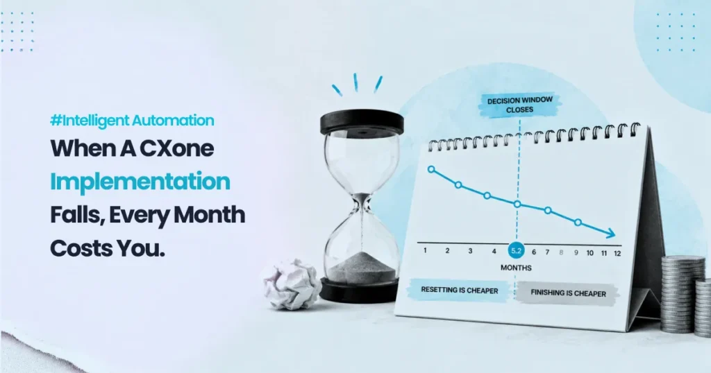
What Happens If CXone Implementation Fails (And Why It Usually Does)

A prospect asked us this on a call last year, about nine months into a build with somebody else: “At what point do we stop trying to fix this and start again?” It is the right question and almost nobody asks it out loud. What gets asked instead is whether the implementation is going badly, which is unanswerable, because every implementation is going badly somewhere. The useful question is narrower and has an actual answer. There is a last month in which starting over is cheaper than carrying on. After that month, the arithmetic flips permanently, and the flip has nothing to do with how much has already been spent. This post works out where that month falls and what moves it. NICE CXone is the platform in the examples, but the structure holds for any contact-centre platform programme where configuration decisions compound. Failure does not arrive on a date The reason the question gets asked at month nine instead of month three is that platform implementations do not fail in a way that produces a notification. Consider what a public audit found when it looked at exactly this. The US Government Accountability Office examined the Internal Revenue Service’s technology modernisation programmes and reported that the agency was meeting most of its quarterly targets. Then it looked underneath the reporting. One key investment “was within schedule estimates for 2019 and 2020” while repeated changes to the overall programme plan “led to a 9-year milestone delay–from 2014 to 2023.” The quarterly reports, , “did not show this lengthy delay because they do not include programs’ historical cost and schedule goals.” Nine years of slippage, invisible in a status report that was accurate every time it was filed. Nobody falsified anything. The reporting measured performance against the current plan, and the current plan had moved. This is the mechanism that makes a CXone implementation feel fine until it obviously is not. Your weekly report says configuration is 70% complete against the plan. It does not say that the plan was rewritten in month four because the original routing design could not accommodate the third business unit, and it will not say that the workaround adopted in month four is the thing that will require rebuilding in month eleven. The same pattern shows up on the UK side, in a programme that is a much closer analogue to a contact-centre replacement. The National Audit Office reviewed National Savings and Investments — an organisation with, in its own reporting, “some 25 million customers, who have collectively invested over £240 billion” — as it replaced a twenty-five-year incumbent supplier with a multi-supplier model. The programme was rated red in the Infrastructure and Projects Authority’s annual reports for two consecutive years, red meaning “successful delivery of the project appears to be unachievable.” The NAO’s conclusion is worth reading slowly: NS&I “underestimated the scale of this challenge and overestimated its ability to deliver the Programme, despite warning signs about its lack of skills and capability and the complexity of disentangling a highly integrated IT system.” And: “The Programme was not sufficiently thought through before key decisions were made, which led to significant cost and time increases.” Those are , published November 2025. “Not sufficiently thought through before key decisions were made” is the whole failure mode in nine words. The decisions were made early. The consequences arrived late. Nothing in between reported a problem. The five things that are actually wrong Before pricing the decision, name what is being decided about. In our experience these are the design faults that surface late and cost the most to unwind, and none of them is a technology defect. Routing built around the org chart rather than the contact. Skills and queues get modelled on how the department is structured, because that is who is in the room during design. Contacts do not arrive knowing your structure, so every contact that spans two teams becomes a transfer, and transfers are invisible in average handle time because each leg gets measured separately. Integrations designed for the demo path. The connection to the customer relationship management system works for a customer record that is complete. A meaningful share of real records are not complete, and nobody profiled them before the design was signed off, so the agent desktop shows a blank panel for cases the design never contemplated. Exceptions treated as a later phase. The configuration handles the contacts that behave, and everything else is documented as “manual handling for now”. The phrase “for now” is doing enormous work in that sentence. Reporting configured to reproduce the old reports. The migration succeeds at making the new platform output the numbers the previous platform output, which means it also reproduces the previous platform’s blind spots and nobody learns anything new for eighteen months. No named owner for configuration after go-live. The partner leaves, the changes queue up with whoever is least busy, and within a year nobody can say why a particular rule exists. Each of these is cheap to change during design and expensive to change once it is load-bearing. That asymmetry is the entire basis of the calculation that follows. Pricing the window Here is the arithmetic that answers the prospect’s question. The figures are illustrative and chosen to be legible, not drawn from a client engagement; the structure is what transfers, and you should substitute your own numbers. A twelve-month programme to go-live. Build spend of €60,000 a month, covering partner fees and internal time. At some month, someone establishes that a material design decision was wrong — one of the five above. Thirty per cent of the configuration built so far sits on that decision. Two forward paths. Finish on the flawed design, then fix it live. You spend the remaining build months as planned, and after go-live you rebuild the affected configuration at 1.8 times what it cost to build the first time, because it is now in production, integrated, and being used. Add four months of

Signs Your Rpa Implementation Needs Expert Help
Blog

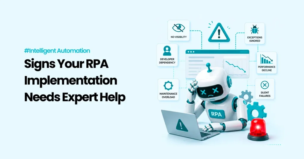
Signs Your RPA Implementation Needs Expert Help (Before It Collapses)

Start with what the failure does not look like. It does not look like an error. There is no red banner, no failed-run alert, no ticket. The scheduler says the job completed. The platform dashboard shows a run-success rate near a hundred percent, and that figure is accurate. The bot started, executed its steps, closed cleanly and logged nothing unusual. It processed four transactions. Last month it processed nine hundred. That is the shape of most RPA trouble that reaches a Chief Operating Officer’s desk — Robotic Process Automation, software that drives existing applications the way a person would, clicking through screens and filling fields. The programme is not down. It is quietly doing less than you are paying it to do, and every instrument you built to watch it is reporting green, because you instrumented the bot rather than the work. So the useful question is not “which of these seven warning signs do I have.” It is narrower and more awkward: when something goes wrong in your automation estate, who finds out first, and how long does it take? Everything expensive follows from the answer. Who tells you first: the four detection routes, cheapest to worst Sort your incidents by who raised them. The ordering is a cost ranking, and most estates discover they live in the bottom half. The process tells you. The automation itself detects that its own output is out of range — volume below a floor, a reconciliation that does not balance, a queue that should have drained and did not — and raises it. This is the cheapest route by a wide margin, because the elapsed time between failure and knowledge is close to zero and the person who receives the alert already has the context to act. A scheduled check tells you. Nobody is watching continuously, but someone or something looks at the process on a defined interval and compares what happened against what should have happened. Cost here is a function of one variable: the length of the interval. That is the whole subject of the arithmetic below. A downstream team tells you. Finance notices the month-end file is short. A team leader notices the work queue is deeper than it should be on a Tuesday. This route is expensive because the delay is unbounded — it depends on when someone happens to look — and because the failure is now a cross-team conversation with a defensive edge to it. Your customer or your regulator tells you. The most expensive route, and the one where the operational cost is the smaller part of the bill. The distinction between the first two and the last two is the distinction Google’s Site Reliability Engineering team draws between monitoring the internals of a system and testing what a user sees from outside. Their framing is worth stealing precisely: black-box monitoring “is symptom-oriented and represents active—not predicted—problems,” while white-box monitoring, which inspects logs and internal state, “allows detection of imminent problems, failures masked by retries, and so forth” (Google SRE Book, Monitoring Distributed Systems). Most RPA estates have neither. They have platform telemetry, which reports whether the robot ran — not whether the work got done. The same chapter names the four signals worth watching on any production service: latency, traffic, errors and saturation. Note that traffic — how much demand the system is actually handling — is on that list, and note that a bot processing four transactions instead of nine hundred is a traffic failure with a clean error log. If you monitor only errors, you have covered one signal in four and you have chosen the one your particular failure mode is most likely to evade. Why the estate gets more fragile the longer it succeeds The uncomfortable property of RPA is that a bot’s dependencies keep moving after the bot stops changing. A vendor patches a web application and shifts a field. Someone adds a mandatory dropdown to a form. A Citrix session renders at a different resolution. None of this is visible from inside the automation, and none of it appears in a change advisory board paper, because nobody filed a change against your bot. Google’s SRE authors named this in the context of their own tooling: automation maintained separately from the core system “suffers from ‘bit rot,’ i.e., not changing when the underlying systems change” (Google SRE Book, The Evolution of Automation at Google). They add the sharper point, which applies directly to a monthly or quarterly automation: work “that is crucial but only executed at infrequent intervals and therefore difficult to test is often particularly fragile because of the extended feedback cycle.” Read that against your own estate. Your highest-risk automations are not your busiest ones. They are the ones that run at period end, where the feedback cycle is a month or a quarter long, and where the first competent observer is the person closing the books. There is a second compounding effect, and it is organisational rather than technical. A bot built by one developer, documented in that developer’s head, becomes an asset nobody can safely modify once that developer moves on. The estate then splits into automations people will touch and automations people work around. The second category grows. What the audit evidence actually shows This is the section where most vendor writing reaches for a statistic about pilot failure rates. Those numbers circulate without denominators, so here are three findings from public audits instead, each with a stated population. Australia’s national audit office examined fourteen artificial-intelligence models the Australian Taxation Office built and deployed over roughly ten months and assessed how they were monitored in production. For one of the fourteen — seven percent — technical performance metrics had been developed. For ten of the fourteen, seventy-one percent, no monitoring metrics were developed at all. And across all fourteen, the audit office found the agency “did not provide evidence of monitoring the effect of AI models on business outcomes, such as savings to

Ai Implementation Challenges -Feature Img
Blog

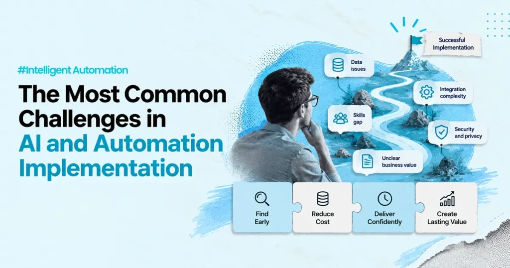
The Most Common Challenges in AI and Automation Implementation

The decision took about ninety seconds. A delivery team was scoping an automation over an order-entry workflow, and someone asked whether they needed to profile the source data before building. The answer was no, because the field list was already in the requirements document and the requirements document had been signed off. Everyone moved on. The requirements document had been written from the customer relationship management screen. The screen showed a clean, single-value country field. The table behind it held three years of free-text entries, because a form validation rule had been added in the second year and nobody had gone back to fix what came before. The automation was built, tested against recent records, piloted against recent records, and went live. It failed on a fifth of the historic backlog, which is where the volume was. Nothing about that failure was unknowable in week one. It was findable with about a day of profiling. It got found in week nine instead, by which time the fix was not a day of profiling but a rebuild of the parsing logic, a re-run of everything already processed, and a conversation with a sponsor who had stopped asking about progress and started asking about the plan. That gap is the actual subject of this article. The challenges below are the ones that come up on nearly every AI and automation programme, and most lists cover them. What most lists leave out is that each challenge has a stage where it is cheap to find and a stage where it is expensive, and the difference is not a rounding error. So rather than walking the challenges in order, this piece sorts them by where they are findable, prices the ladder, and then says what you can buy that moves a problem down it. First, a working definition Intelligent automation is not a product. It is a workflow, a set of connections between systems, and artificial intelligence applied at the points where the inputs are not predictable. Robotic process automation, usually shortened to RPA, is the part that drives existing screens and applications when there is no application programming interface, or API, available to call instead. AI is the part that copes with email text, documents, and free-form requests. If you want the longer version of that distinction, we have written it up separately. Definitions matter here only because they set the boundary of what can go wrong. A workflow can be wrong. A connection can be wrong. A model can be wrong. And all three can be wrong in ways that a demonstration will not show you. Five places a problem can be found, and what each one costs Take one material defect. Not a typo, not a cosmetic issue, but something that means the automation produces a wrong or unusable result on a real class of input. Here is what clearing that single defect costs at each of five detection points, at a blended delivery rate of EUR 85 per hour. Found in discovery or design, before anything is built: about 2 hours, so EUR 170. You change a diagram and a decision. Found during build: about 6 hours, EUR 510. You change code that exists but has no dependents yet. Found in user acceptance testing: about 14 hours, EUR 1,190. You change code, re-run the test cycle, and update the test evidence. Found in a pilot: about 30 hours, EUR 2,550. Add a regression pass, a change record, and a re-brief for the pilot group. Found live, at full volume: about 70 hours, EUR 5,950. Add impact analysis, an emergency change window, and a fix that has to work first time. The live figure carries a second cost that the earlier ones do not. By the time a full-volume defect is visible, work has already been processed wrongly. Assume 40 items at 12 minutes each to identify and correct, at a business-side rate of EUR 40 per hour. That is 8 hours and EUR 320, which takes the true cost of one late defect to EUR 6,270, against EUR 170 for the same defect caught in discovery. There is a harder version of the live case. On one engagement for a Nordic healthcare provider, the workflow could not be taken offline to be corrected, because the service it fed had no acceptable downtime window. The correction had to be designed, built, and deployed while the automation kept running, with a rollback path proven before anything was applied. Nothing about the underlying defect was unusual. The constraint on when it could be fixed is what made it expensive. A worked model: the same twelve defects, found in two different places This model is illustrative. The rates and hours are plausible mid-market figures, not measurements from a specific client, and the point of publishing the arithmetic is that you can substitute your own numbers and see whether the conclusion survives. It is built to make one comparison only, and it deliberately holds the thing most business cases quietly change. The programme has twelve material defects. Both versions have all twelve. No readiness activity removes a defect from existence. It only moves the rung at which the defect is found. That constraint is what makes this different from a savings case, because there is no productivity assumption anywhere in it. Where the twelve surfaced Version one, thin discovery and no pilot. Two workshops, the requirements document, straight into build, one round of user acceptance testing on recent data, go live. Discovery: 1 defect Build: 2 defects User acceptance testing: 3 defects Pilot: 2 defects Live at full volume: 4 defects Version two, readiness first. Process discovery run against the actual work rather than the described work, a data profiling pass over the full history rather than the recent slice, and a pilot restricted to one variant of the workflow so that failures are legible. Discovery: 5 defects Build: 3 defects User acceptance testing: 2 defects Pilot: 1 defect Live at full volume: 1

Intelligent Automation
Blog

Intelligent Automation: Practical Trends Shaping the Future of Work

A vendor put a number in front of a finance director last spring: 82 percent of invoices would go straight through, untouched. Sixty thousand invoices a year, eleven minutes each by hand. The arithmetic on the slide came out at four hundred and sixteen thousand dollars of freed labour against a hundred and fifty-two thousand of annual cost. A hundred and seventy-four percent return. The number was not dishonest. It was incomplete in three specific places, and each of the three maps onto one of the trends everybody is writing about this year. That is the useful way into intelligent automation: not as a list of capabilities, but as a list of things that each generate work someone has to absorb after go-live. What intelligent automation actually is Intelligent automation is the combination of rule-based automation, robotic process automation (RPA), machine learning models, and workflow orchestration, applied to a single business process end to end. RPA is software that drives existing applications the way a person would, through their screens and interfaces. Orchestration is the layer that decides what happens next and who gets involved. The definition needs no citation because it is a description, not a claim. What needs a citation is the origin of the word everyone reaches for next. Trend one: hyperautomation, and the discipline it was defined with Gartner introduced hyperautomation as its first of ten strategic technology trends for 2020, in research published on 21 October 2019 by David Cearley, Nick Jones, David Smith, Brian Burke, Arun Chandrasekaran and CK Lu. The definition is more demanding than the way the word gets used now. Gartner described hyperautomation hyperautomation as the combination of multiple machine learning, packaged software and automation tools to deliver work, and specified that it refers “not only to the breadth of the pallet of tools, but also to all the steps of automation itself (discover, analyze, design, automate, measure, monitor and reassess).” Read that list of steps again. Three of the eight are things you do after the automation is running: measure, monitor, reassess. Gartner also said plainly that “RPA alone is not hyperautomation.” So the term that gets used to mean more automation was defined to mean automation plus a measurement and reassessment loop. Most programmes buy the first half. The reason this matters for the invoice model is that the vendor’s 82 percent touchless rate assumed the remaining 18 percent would still take eleven minutes each, the same as before. Exceptions do not work that way. When the clean cases leave the queue, what remains is the hard residue, and it takes longer per item than the blended average ever did. Trend two: AI-assisted workflow, where the exception rate is the whole story Rule-based automation fails loudly. A rule either matches or it does not. AI-assisted workflow fails quietly: it produces an output that is well-formed, plausible, and wrong, and nothing in the pipeline objects. That is why the observed exception rate, not the touchless rate, is the number the business case turns on. In the invoice case the real figure after four months of production was 26 percent, not 18, and those exceptions averaged fourteen minutes each rather than eleven, because the residue was the awkward supplier formats and the partial deliveries. Here is the whole model, and it is illustrative. Substitute your own figures; what is being shown is the shape of the calculation, not a price list. Sixty thousand invoices a year. Eleven minutes each by hand. Labour rate derived from a fully loaded cost of $71,000 for a processor, divided by productive hours rather than paid hours: 2,080 paid hours less 26 percent shrinkage for leave, training, sickness and non-productive time gives 1,539.2 productive hours, so $46.13 an hour. Baseline: 11,000 hours, or $507,406 a year. After go-live, at a 26 percent exception rate and fourteen minutes per exception, exception handling consumes 3,640 hours. Freed hours: 7,360, worth $339,501 at the processor rate. Annual cost: build of $210,000 amortised over a three-year life is $70,000, plus $58,000 of licence share and $24,000 of support and maintenance. Total $152,000. Those are plausible market rates for a programme of this size rather than quotes from a specific price list, and should be treated as such. Then the part the vendor slide did not have, which is the subject of the next two trends. Trend three: low-code and no-code, and the inventory nobody is keeping Low-code and no-code platforms let people who are not developers build working applications. Gartner’s 2019 research called this democratisation of expertise and predicted it would accelerate through 2023, including “democratization of design (expanding on the low-code, no-code phenomena with automation of additional application development functions to empower the citizen-developer).” That happened. What it produces is an asset class with no owner. The Open Web Application Security Project, a vendor-neutral non-profit, maintains a Top 10 for exactly this, and its ninth entry, asset management failures, describes the mechanism better than any vendor page will: citizen-developed applications “are prone to being forgotten or abandoned while remaining active and functional,” and useful internal applications “become widely shared within the organization, scaling rapidly in usage and dependency without the necessary business continuity measure expected of more standardized and essential systems such as having designated owners, IT monitoring, or a Service Level Agreement (SLA).” Note what that is not. It is not a security-scare argument. It is an operations argument with a cost attached: something that is running, that people depend on, that nobody is named against. In the invoice programme there were 34 such assets by month four, and keeping an inventory current, with an owner name and a last-reviewed date against each one, took about nine hours per asset per year. 306 hours, at a reviewer rate of $67.57 an hour derived the same way from a $104,000 fully loaded cost. The counter-metric here pairs naturally: count assets built alongside assets with a named owner and a review date inside the last quarter. The first number

Emotion Recognition In Customer Service -Feature Img
Blog

Emotion Recognition in Customer Service: What the Score Actually Measures

Two people can use the phrase “emotion recognition” in the same meeting and mean incompatible things. Under European law it has a narrow, technical meaning. Regulation (EU) 2024/1689, the European Union’s AI Act, defines an emotion recognition system as one that infers emotions or intentions on the basis of biometric data, and biometric data means data resulting from technical processing of physical, physiological or behavioural characteristics. The recitals draw the line further in. The concept covers emotions such as happiness, sadness, anger and shame, and expressly excludes physical states such as pain or fatigue, along with the “mere detection of readily apparent expressions.” Inside a contact centre platform, the thing on the dashboard is usually something else entirely. It reads the transcript. It looks for words and phrases. It scores them. Those are two different systems, with two different failure modes and two different regulatory positions, and the gap between them is where most emotion-analytics programmes go wrong. Not because anyone lied, but because the buyer bought the first definition and got the second. This piece works through what the score is actually made of, what a wrong score costs, and the accuracy level below which the whole exercise loses money. Claim one: “it hears the frustration in their voice” Check this one first, because it is the claim buyers repeat internally and the one most likely to be false. NICE’s own Key Terms and Metrics documentation for Interaction Analytics (CXone) states it twice, unambiguously. Of sentiment: “Sentiment scores are not influenced by voice characteristics, such as tone, volume, and speed.” Of frustration: “Frustration cues are not influenced by voice characteristics, such as tone, volume, and speed.” That is the platform partner describing its own product the platform partner describing its own product. So the score is a language score. It matches cues in the transcript, phrases such as “I want to speak to your manager,” “This is the third time I’ve called,” “I’m sick and tired of this,” “I’m not happy about the delay.” A customer who says none of those things in a flat, resigned voice scores neutral. A customer who says all of them cheerfully scores frustrated. Three consequences follow directly, and none of them are visible in a demo. The transcript is the ceiling. Everything downstream inherits speech recognition quality. Where recognition confidence is low on a given call, the cue match degrades before the score does, and the score does not report that it happened. This is the same dependency chain that governs automated call summaries automated call summaries, and it fails in the same direction. Frustration and sentiment are not the same instrument. Per the same documentation, frustration measures cues for the client only, while sentiment can measure cues for both the client and the agent. The relationship between them is asymmetric: all frustrated interactions should also be negative, but negative sentiment does not always correlate with frustration. Treat the two as interchangeable in a report and you produce numbers that cannot be reconciled with each other. The window matters more than the score. Beginning Sentiment is determined by the first 400 words or the first 30% of the interaction, whichever comes first. End Sentiment is determined by the last 30%. Neither can return a Mixed value. A call that opens badly and ends well produces a specific pair of values, and a report that averages them has destroyed the only interesting thing in the data. Claim two: “the number tells you the customer is angry” It tells you cues appeared and were weighted. Those are different statements. Sentiment is calculated by applying specific weights to each cue, described in the documentation as overwrite, strong, weak and yield. An interaction can therefore be categorised as Mixed even when the raw count of one cue type is significantly higher than the other. The score is not a tally. Anyone who builds a report on the assumption that more negative phrases produce a more negative score will find cases that contradict them and will have no way to explain why. The documentation is also honest about attribution in a way internal reporting rarely is. Negative sentiment does not have to mean there is a problem with agent performance or behaviour. It can stem from a product issue, a billing challenge, or an event entirely outside the agent’s control. That single sentence should govern how the metric is allowed to be used. A frustration score attached to an agent’s name, on a dashboard a team leader reviews weekly, is substantially a measurement of the queue that agent was given. Independent research points the same way. In work presented at the 2021 Affective Computing and Intelligent Interaction conference, researchers from Microsoft and Stanford observed that tools traditionally used by domain experts are now used by individuals often unaware of the technology’s limitations and in potentially harmful settings, and proposed twelve guidelines for systematically assessing and reducing that risk. The most useful one for a contact centre is also the least technical: be explicit about what the output is not evidence of. Claim three: the honest arithmetic of a false flag A frustration flag has no value on its own. Value appears only when someone does something differently because of it, and the doing costs money whether or not the flag was correct. So the useful model here is not a savings model. It is a model of what it costs to be wrong, and how often you can afford it. The scope, stated tightly The figures below are illustrative. They are shaped to be plausible rather than taken from any engagement, and the labour costs and licence share are market-shaped assumptions rather than price-list entries. Substitute your own numbers. What is being demonstrated is the shape of the calculation and the thresholds it produces, not the result. One line of business. 40,000 inbound interactions a month, 6% carrying frustration cues, so 2,400 flagged interactions. Every flagged interaction gets a four-minute analyst review before anyone acts on it. Confirmed cases

How Ai Improves Contact Centers
Blog

How AI Improves Contact Centers With Speech-to-Text Summaries

A head of customer operations asked us this last quarter, almost as an aside: “If the summary writes itself in ten seconds, why is my after-call work only down by a third?” It is the right question and the answer is not a tuning problem. Automatic summarisation removes one task and adds two. Typing goes away. Reading arrives, and so does checking. Whether the trade is worth making depends on how long the summary is, how often it is wrong, and how many people actually read it before it becomes the record — and those three variables interact in ways that a demo will never show you, because in a demo the summary is always short, always right, and always read. What follows is the journey of one summary, from the moment the call drops to the moment somebody downstream relies on it. Seven stages, each with its own failure mode, its own cost, and its own sampling test. The arithmetic sits in one place near the end, with the breakevens and one scenario where the whole thing loses money. The seven stages, before we price any of them A generated summary is not a document that appears. It is a small workflow with a human step in the middle of it, and the human step is the one nobody budgets for. The stages are: the interaction ends and the platform generates text; the agent reads what was generated; the agent corrects it if it is wrong; the agent saves it, which is what closes the interaction; the saved text either reaches the system of record or does not; a later agent or a back-office colleague relies on it; and somebody, eventually, monitors whether the whole arrangement is behaving. Six of the seven are where the value is. Two of the seven are where the new cost is. One of them — the last — is where the regulator is. That framing matters because the standard business case prices stage one and ignores stages two through four. This piece prices all of them. 1 Stage one — the platform generates text, within limits Speech-to-text converts spoken audio into a written transcript. Summarisation compresses that transcript into something short and structured: why the customer made contact, what the agent did, what was agreed, and what happens next. Both are ordinary capabilities now, available inside contact-centre platforms and as standalone services. Neither needs defending. What does need reading carefully is what the platform documentation says about the limits, because the limits are what your process has to absorb. Taking the platform PAteam implements as the worked example, and noting the obvious interest — NICE is our platform partner, so treat this as a partner’s documentation rather than a neutral review — the states several things that shape the design directly. Summaries are “typically generated within 5 to 10 seconds after an interaction ends,” but the spinner in the agent’s Notes field “may remain active for up to 60 seconds — this is expected behavior,” and if nothing appears after sixty seconds “the request has timed out and agents can manually enter notes in the Notes field.” Summary length is configurable “between 40 and 250 words.” The feature works on voice and digital messaging channels and “does not currently support summarization for the email channel.” Read those four facts together and a design constraint falls out that has nothing to do with model quality. You need a manual fallback path that agents are trained on and that quality assurance treats as a legitimate outcome rather than a defect, because the documentation tells you the timeout exists. And if a meaningful share of your contact volume is email, summarisation is not the automation that helps you there — a different one is, and pretending otherwise is how a programme ends up with a coverage problem it did not plan for coverage problem it did not plan for. 2 Stage two — somebody has to read it Here is where the honest model departs from the vendor model. Typing a wrap-up note from memory takes real time. Reading a generated note also takes real time, and reading time scales with the setting an administrator picked in a configuration screen. At an on-screen reading speed of two hundred words a minute, a forty-word summary costs twelve seconds to read and a two-hundred-and-fifty-word summary costs seventy-five. That is not a rounding error against a typing task of a minute or so. It is the whole margin. Which produces the single most actionable finding in this piece: summary length is the variable your business case is most sensitive to, and it is the one variable nobody negotiates. It gets set once, during configuration, usually toward the generous end, because longer summaries look more thorough in a demonstration and demonstrations are where the setting gets chosen. 3 Stage three — sometimes the agent has to correct it Generated summaries of conversations are wrong more often than the marketing suggests, and the research on this is specific enough to build a plan around. In , presented at the 2022 Conference on Empirical Methods in Natural Language Processing, Wang and colleagues performed a fine-grained human analysis and report that “over 35% of generated summaries are faithfully inconsistent respective the source dialogues.” The more recent and more granular picture comes from , published at NAACL 2024 by a team at AWS AI Labs with collaborators at KAIST and Columbia. Its denominators are stated plainly, which is why it is worth citing at all: 1,479 topic-focused summaries comprising 3,966 summary sentences, generated by five different large language models across meeting and media-interview transcripts, with every sentence judged by human annotators. The findings that matter operationally are these three. First, on the MeetingBank portion — transcripts of actual meetings, the closest analogue to a service conversation — the average share of summaries containing at least one main-topic factual error was 30.4 per cent, and across all the models evaluated except one, “approximately 40–50%

Scroll to Top